

These days, “natural” claims are on everything from supermarket chicken to shampoo. So how can pet food brands face the growing challenge of standing out to and building trust with discerning pet parents?
One answer is provenance. Specifically, being proudly and transparently ‘Made in the UK’.
While other industries like fashion, farming and beauty have long capitalised on local production, the pet sector has been slower to claim this space, but that’s changing. As pet ownership becomes more personal, emotional and premiumised, British manufacturing is being used as a shorthand for care, quality, and credibility.
The new trust economy
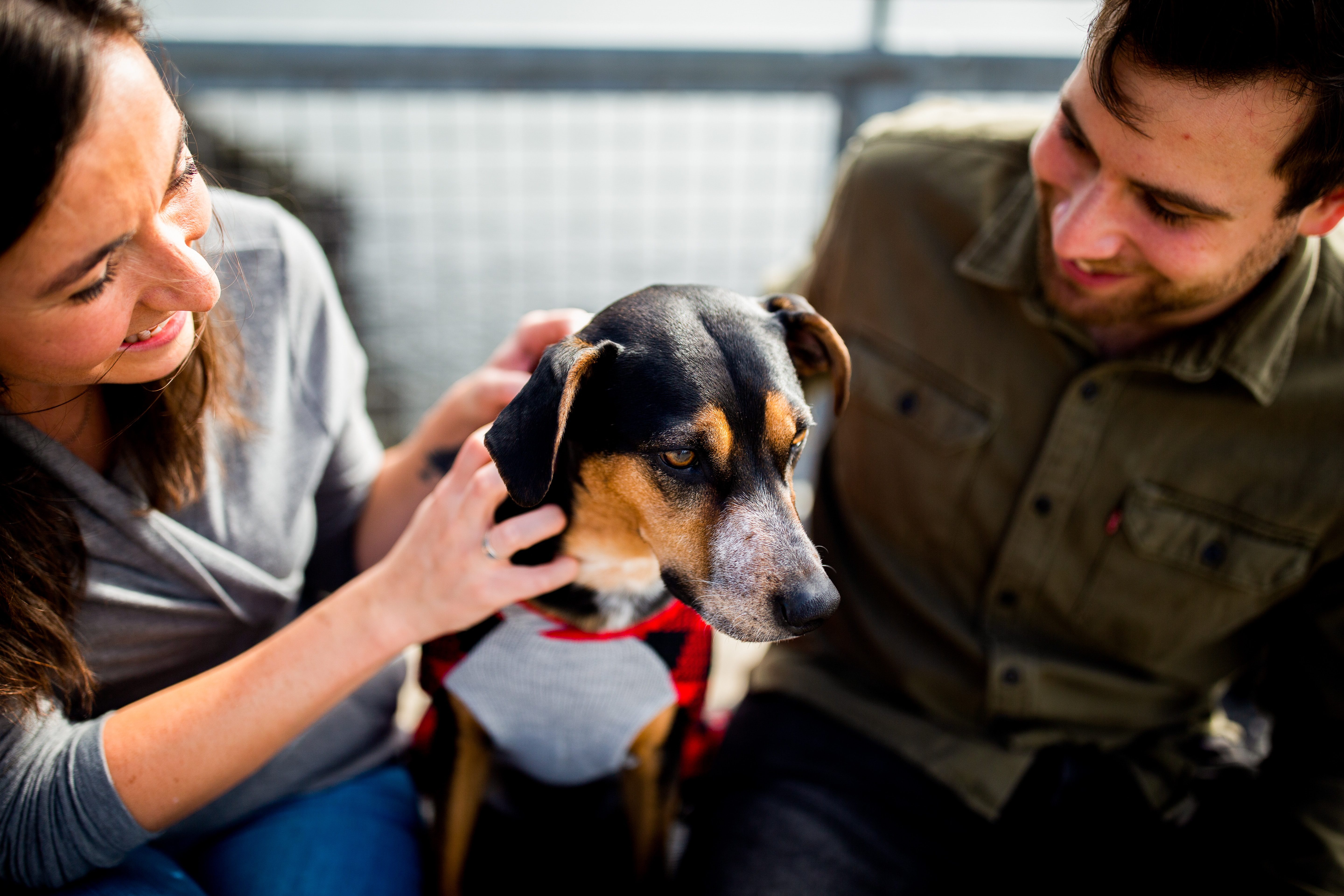
Today’s pet owners aren’t just looking at what percentage of meat is in their pet’s food, or the price per kilo. They’re looking for brands they can believe in – brands that share their values and back them up with substance.
Made in the UK messaging delivers on two key fronts: trust and traceability. For one, UK food regulations are seen as some of the most robust in the world. Add to that shorter supply chains, fewer food miles, and local job creation, and it becomes a powerful story. The challenge is making that story visible without turning packaging into a wall of certifications.
That’s where design plays a crucial role. It can make British provenance feel natural, embedded and emotionally resonant, rather than clinical or transactional. Through subtle graphic cues or clever copywriting, provenance can become a part of the story, not just a stamp.
Emotional connection meets rational reassurance
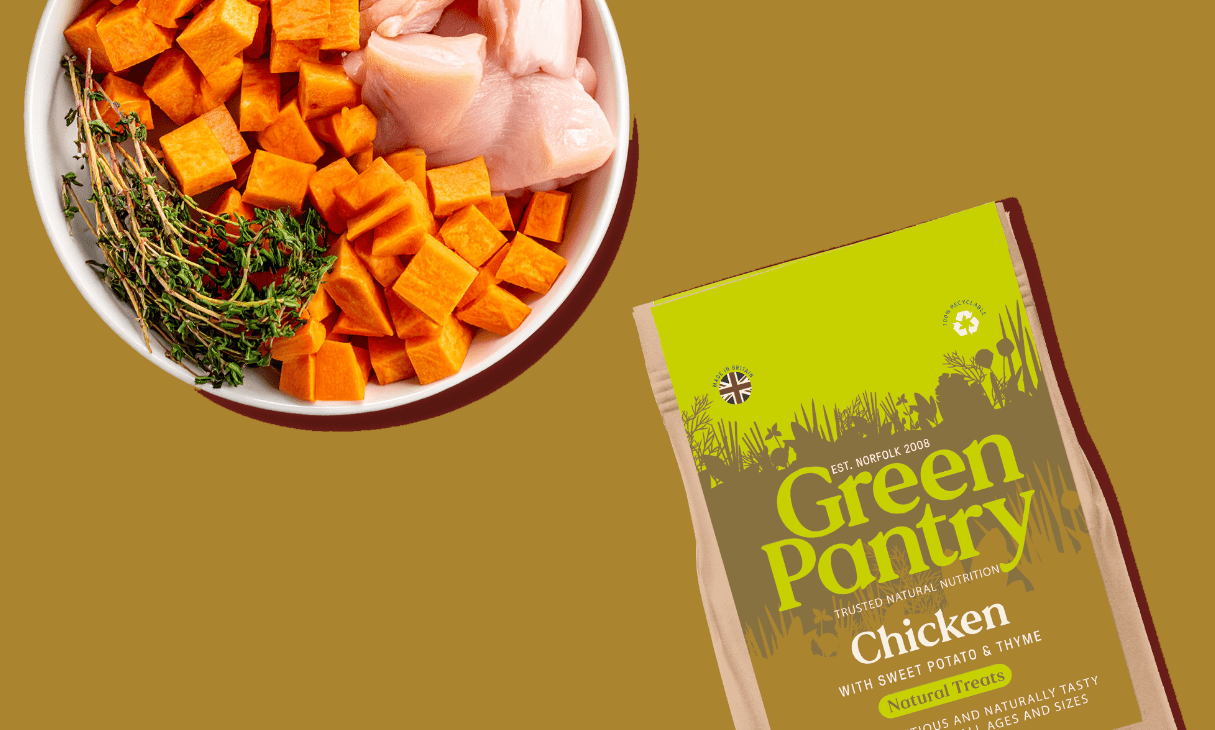
Some brands strike this balance with real clarity. Harringtons Just 6, for example, integrates a stylised Union Jack into its clean, minimal pack design. It’s a simple but effective cue that reinforces British provenance without overwhelming the brand.
Others, like Butternut Box, take a more expressive route. Their use of cheeky British humour and everyday colloquialisms creates a warm, familiar tone that builds trust in a more conversational way.
These contrasting approaches show there’s no single formula. What matters is that the tone of voice and visual identity work together to reflect the brand’s values. Whether rooted in science, simplicity or charm, the key is consistency across every touchpoint, so that trust and provenance feel embedded rather than surface-level.
From kibble fatigue to fresh food culture
Alongside provenance, the format of pet food is changing too. Kibble is in decline, not just because of ingredient concerns, but because of perception. Dry pellets feel dated in a world where pet food is increasingly “humanised.” It’s a bit like how parents binned off Turkey Twizzlers after Jamie Oliver lifted the lid – once you know what’s really in there, it’s hard to unsee.
Fresh food, personalised meal plans, supplements, and even vegetarian or flexitarian options are reshaping the category. These trends mirror wider consumer habits – from clean eating to primal diets – and reflect a deeper desire for control, quality, and care. If people scrutinise what goes into their own meals, why wouldn’t they do the same for their pets?
This is where brands need to think beyond nutrition and into experience. The packaging is no longer just a container – it’s part of the ritual. For subscription-based or DTC formats, every unboxing moment is an opportunity to reinforce trust, share values, and educate.
Some brands are even including welcome magazines, ingredient explainers or supplement guidance, creating an experience as much for the owner as the animal. They aren’t shy about sharing where ingredients are from, where the food is made and who makes it.
Missed opportunities and diluted credibility
In a market where the word natural is becoming overused and diluted, the most effective differentiators are the ones you can prove. Provenance – when backed by clear, consistent storytelling – offers exactly that.
The risk for premium-positioned brands that ignore this is clear. They may look the part, but without clarity on where and how their products are made, they risk eroding consumer confidence. That gap between perception and reality can make a brand feel more style than substance.
Provenance doesn’t need to dominate the brand, but it should be traceable across every touchpoint. That includes packaging, of course, but also web, social, advertising, and customer service. It could be as simple as including a map of your sourcing process, or translating a distinctive local landmark into a graphic device that anchors the brand’s story.
Learning from beyond the bowl
Pet brands would do well to look beyond their own category to DTC brands in snacks, coffee, or skincare. Provenance is often baked into their storytelling, from sourcing maps to producer profiles to on-pack illustrations that show exactly where ingredients come from. The best of them make you feel like you know the product before you’ve even tried it.
One standout example outside of pet food is crisp brand Fairfields Farm. The potatoes are grown and processed on the same farm, just 100 metres apart. Their packaging shows this journey clearly, with visuals that ground the product in place and purpose. It’s the kind of storytelling that could translate beautifully into pet food, especially for brands with true farm-to-bowl credentials.
A quiet revolution
‘Made in the UK’ might not feel like a revolutionary statement, but in a sector shaped by emotion, trust, and care, it can be a quiet superpower. When treated with nuance and consistency, it helps brands say: you can trust us with what matters most to you.
In a saturated market where pet parents are more clued up than ever, that might be the most important message of all.
Contributed by Joe Wallis, design director at OurCreative